
Brand
Colour
Navy, white, gold
Navy carries authority and reads well as a background or headline colour; gold is the accent, used sparingly for emphasis, links and calls to action; white is the working background for most layouts.
Typography
Lato, every weight
The site's CMS supports one font family, so Lato does every job — headlines through captions — carried by weight and size rather than a second typeface.
Local radio, right up your street
H1 · Lato 900 · 32px
Putting local news, first.
H2 · Lato 700 · 24px
On Air Now
H3 · Lato 700 · 19px
Suffolk news first — from Lowestoft to Framlingham, we cover the stories that affect your community.
Body · Lato 400 · 16px
Licensed to play music by PPL and PRS
Caption · Lato 400 italic · 13px
Logo
One lockup, two colourways
Always with the "local radio, right up your street" slogan. Colour for light backgrounds, white for navy or photo backgrounds.
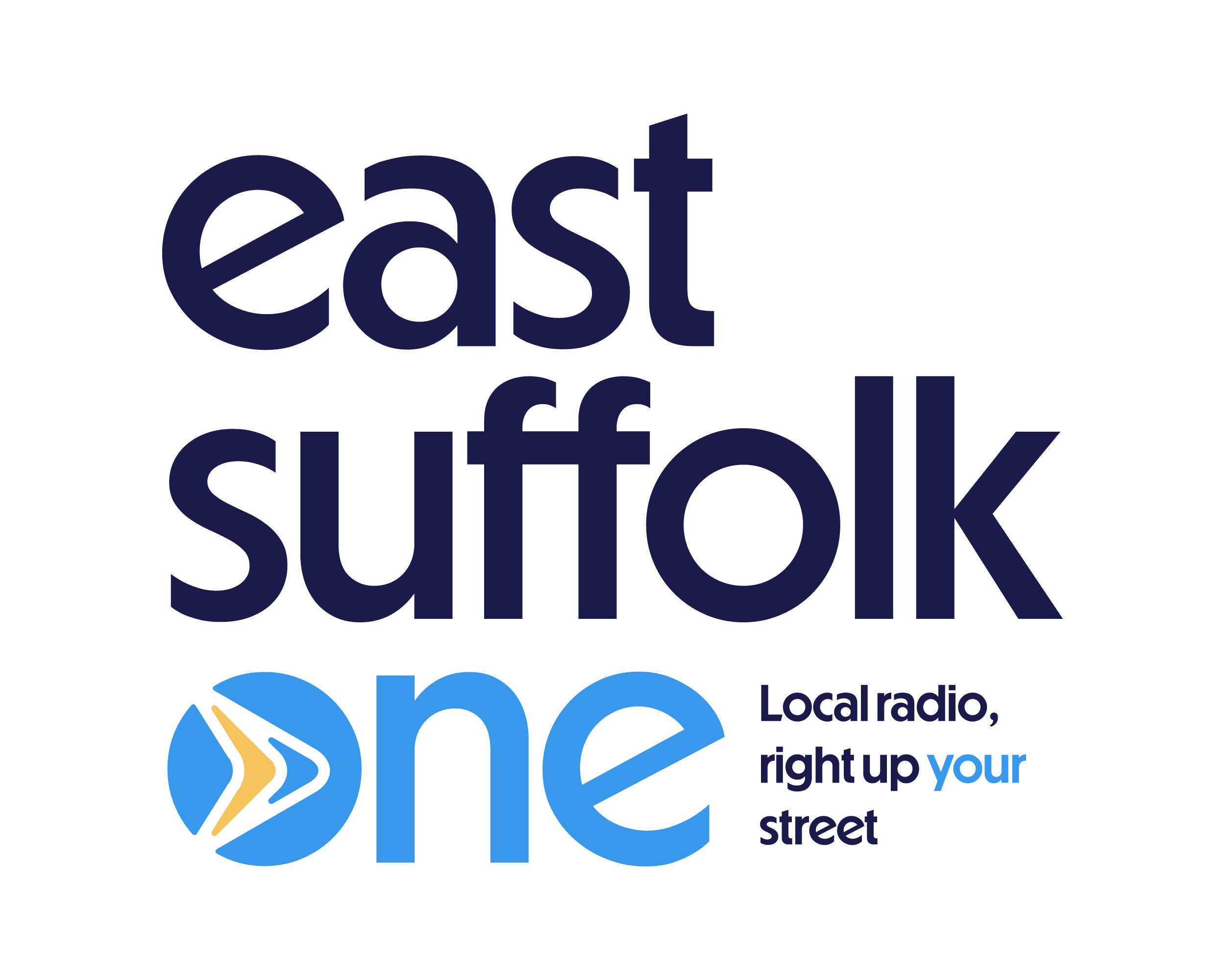
Clear space: keep a gap around the logo at least the height of the "E" in East on all sides.
Minimum size: don't shrink the logo below ~120px wide — legibility of the slogan breaks down below that.
Voice
Local, warm, on your side
The tone across the site and socials — friendly and specific to East Suffolk, never generic radio-speak.
Local radio, right up your street.
Suffolk news first — from Lowestoft to Framlingham.
No experience needed — just enthusiasm.
Usage
Keep it consistent
Do
- Use navy as the dominant colour, gold as the accent
- Set headlines in Lato Bold or Black
- Name real East Suffolk places and events in copy
- Leave clear space around the logo
Don't
- Recolour the logo or place it on a busy photo
- Introduce a second typeface
- Stretch or skew the logo lockups
- Use gold for large background areas
Assets